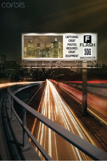
Designed by Daniel Lute for GRPH310 @ Franklin University
Daniel Lute @ djlute.com
Copyright 2013. All Rights Reserved


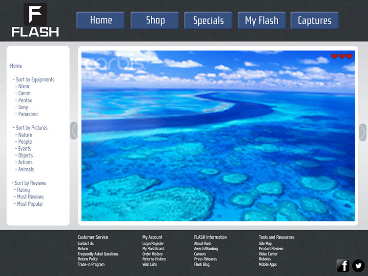

![Allofs, T. (n.d.). Australia's Great Barrier Reef [Stock Image]. Retrieved December 1, 2013, from http://www.corbisimages.com/stock-photo/rights-managed/AACD0563/australias-great-barrier-reef?popup=1 Becar, M. (n.d.). Flash [Stock Image]. Retrieved November 3, 2013, from http://www.gettyimages.com/detail/photo/flash-royalty-free-image/104018942 Beissel, J. (2010, September 28). Marketing Must: Why You Need Promotional USB Flash Drives [Web log post]. In Premium USB Blog. Retrieved November 9, 2013, from http://blog.premiumusb.com/2010/09/why-marketing-need-promotional-usb-flash-drives/ Canon EOS Rebel T3i [Photography]. (n.d.). In B&H Photo Video. Retrieved December 1, 2013, from http://www.bhphotovideo.com/c/product/753762-REG/Canon_5169B003_EOS_Rebel_T3i_Digital.html City billboard. [Stock Image]. (n.d.). In Corbis Images. Retrieved November 17, 2013, from http://www.corbisimages.com/images/Corbis-42-41658335.jpg?size=67&uid=dd756157-a055-44cf-a367-f2a65689aba1 Collateral Design. (n.d.) In Westway Studio. Retrieved December 20, 2013, from http://www.westwaystudio.com/design_collateral.html Collins, C. (n.d.). High definition video camera [Stock Image]. In Corbis Images. Retrieved December 16, 2013, from http://www.corbisimages.com/stock-photo/rights-managed/42-22999012/high-definition-video-camera?popup=1 Cordoza, T. (n.d.). Digital Camera [Stock Image]. Retrieved Novemember 3, 2013, from http://www.gettyimages.com/detail/photo/digital-camera-royalty-free-image/146182541 Cruz, J. (n.d.). Lighting equipments in photographer's studio [Stock Image]. Retrieved December 1, 2013, from http://www.corbisimages.com/stock-photo/royalty-free/42-35809255/lighting-equipments-in-photographers-studio?popup=1 Evans, T. & Thomas, M. (2008). Exploring: The Elements of Design (2nd ed.). Clifton Park, NY: Delmar Cengage Learning.
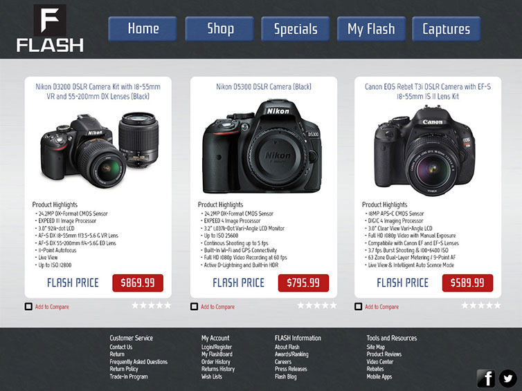
Landa, R. (2011). Graphic Design: Solutions (4th ed.). Boston, MA: Wadsworth. Manning, L. (n.d.). Memory Cards [Stock Image]. Retrieved December 1, 2013, from http://www.corbisimages.com/stock-photo/royalty-free/CB054738/memory-cards?popup=1 Mnich, M. (n.d.). Digital camera [Stock Image]. Retrieved November 3, 2013, from http://www.gettyimages.com/detail/photo/digital-camera-royalty-free-image/182891784 Muller, P. (n.d.). Portrait of American football player resting foot on ball [Stock Image]. In Corbis Image. Retrieved December 19, 2013, from http://www.corbisimages.com/stock-photo/rights-managed/42-52318295/portrait-of-american-football-player-resting-foot?popup=1 Nikon D3200 [Photography]. (n.d.). In B&H Photo Video. Retrieved December 1, 2013, from http://www.bhphotovideo.com/c/product/1010451-REG/nikon_13309_d3200_dslr_camera_kit.html Nikon D5300 [Photography]. (n.d.). In B&H Photo Video. Retrieved December 1, 2013, from http://www.bhphotovideo.com/c/product/1010022-REG/nikon_1519_d5300_dslr_camera_black.html O’Rear, C. (n.d.) Photographer’s Cameras and Equipment [Stock Image]. In Corbis Images. Retrieved December 16, 2013, from http://www.corbisimages.com/stock-photo/rights-managed/OR006027/photographers-cameras-and-equipment?popup=1 Press Releases. (2012). In CEB. Retrieved November 9, 2013, from http://news.executiveboard.com/2012-12-17-Gift-Card-Sales-To-Top-110-Billion-As-Card-Spillage-Declines-20-Percent Spielman, J. (n.d.). Lower Manhattan skyline at night, New York City, New York, USA. [Stock Image]. In corbie images. Retrieved November 17, 2013, from http://www.corbisimages.com/images/Corbis-42-27340229.jpg?size=67&uid=35880a30-fe64-4313-80f3-7641ddb7efb9 Vector illustration of camera lens on white [Stock Image]. (2010). Retrieved November 3, 2013, from http://www.canstockphoto.com/vector-illustration-of-camera-lens-5077380.html Vogel, B. (n.d.) Lonely model in photostudio [Stock Image]. In Corbis Images. Retrieved December 16, 2013, from http://www.corbisimages.com/stock-photo/rights-managed/42-31576542/lonely-model-in-photostudio-?popup=1](images/u7514-64.png)